
Making informed decisions based on analytical insights has become crucial for success in today’s data-driven world. One of the most effective ways to gain actionable insights is through the use of visually appealing and interactive dashboards.
In this guide, we will explore how you can master the art of creating eye-catching dashboards using the powerful tool, Power BI.
Getting Started with Power BI
Power BI is a robust business analytics tool that allows you to connect to multiple data sources, transform raw data into meaningful visualisations, and share your insights with others. To begin your journey with Power BI, you need to download and install the software. Once installed, you can start exploring its features and familiarise yourself with its user-friendly interface.
Creating a Dashboard in Power BI
A dashboard is a visual representation of your data that provides a clear overview of key metrics and trends. To create a dashboard in Power BI, you need to first understand the concept and purpose of dashboards. Then, you can choose the right data sources and import them into Power BI.
By connecting your data to Power BI, you can easily transform it into meaningful visualisations.
Video courtesy of @LeilaGharani via YouTube Videos.
Designing Powerful Visualisations
Creating visually appealing dashboards requires careful consideration of the appropriate visual components for your data. Power BI offers a wide range of visualisation options, including charts, graphs, and tables.
By customising the visual properties, such as colours, labels, and axes, you can improve clarity and impact. It is essential to follow best practices when visualising numeric data, time-series data, and hierarchies to ensure effective communication of insights.
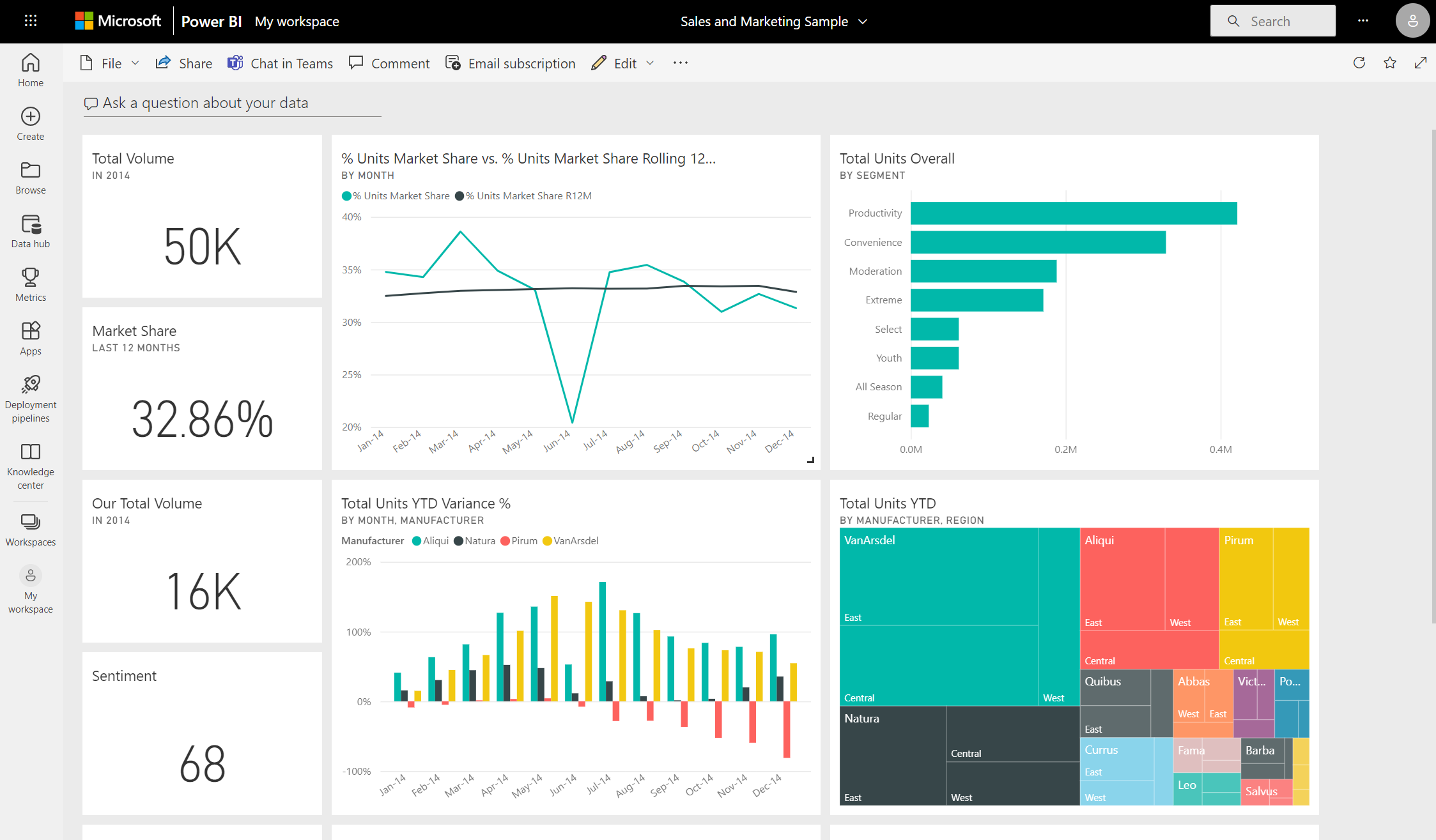
Image courtesy of learn.microsoft.com via Microsoft Learn
Enhancing Dashboards with Interactivity
Power BI allows you to add interactive elements, such as filters and slicers, to your dashboards. These interactive features enable users to explore and drill down into specific aspects of the data, gaining deeper insights.
Leveraging Power BI’s interactive capabilities can significantly enhance the user experience by providing more interactive and engaging dashboards.
Video courtesy of @PavanLalwani via YouTube Videos.
Implementing Data-Driven Insights
Power BI comes equipped with built-in AI capabilities that allow for advanced data analysis. By leveraging these features, you can gain data-driven insights and uncover hidden patterns and trends.
Additionally, you can create calculated fields, measures, and key performance indicators (KPIs) to measure the performance of your data. Power BI’s robust data modelling features can also help in accurately modelling and analysing complex datasets.
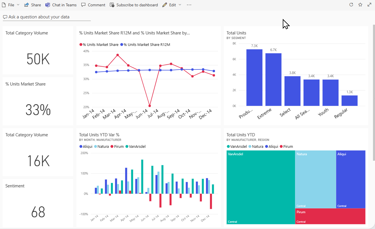
Image courtesy of learn.microsoft.com via Microsoft Learn
Sharing and Collaborating on Dashboards
Collaboration is essential when it comes to sharing dashboards with team members or stakeholders. Power BI provides options to share dashboards with specific individuals or groups, control access and permissions, and collaborate in real-time. Leveraging Power BI’s collaboration features can improve teamwork and enable effective decision-making across the company.
Video courtesy of @GuyInACube via YouTube Videos.
Tips for Data-Driven Success
To ensure continued success with your data-driven approach, it is essential to regularly update and maintain your dashboards. Monitoring key performance indicators (KPIs) allows you to focus on areas that need improvement and make data-driven decisions accordingly.
Integrating Power BI dashboards into your software development workflow can help you streamline processes and optimise decision-making.
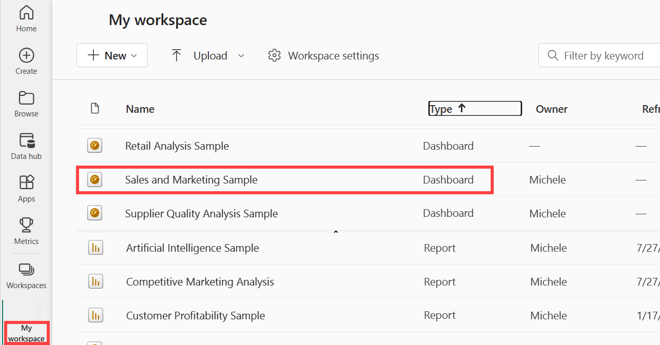
Image courtesy of learn.microsoft.com via Microsoft Learn
Conclusion
Power BI is a powerful tool that empowers you to create visually stunning and interactive dashboards. By leveraging the features and functionalities of Power BI, you can unlock the true potential of your data and make data-driven decisions that drive success. Start exploring Power BI today and take your visualisations to the next level.
FAQ Corner
How can I connect Power BI to my data sources?
Power BI offers a wide range of options to connect to your data sources. You can connect directly to data in the cloud (such as Azure SQL Database, Azure Analysis Services, Salesforce, Dynamics 365), on-premises databases (SQL Server, Oracle, IBM DB2), flat files (CSV, Excel), and web APIs. The process involves:
- Opening Power BI Desktop.
- Select “Get Data” from the Home tab.
- Choose your data source and follow the prompts to connect, which may involve entering credentials or specifying connection details.
This allows for live connections to databases, online services, or loading data into Power BI’s in-memory model for analysis.
What types of visualisations can I create in Power BI?
Power BI supports a variety of visualisation types to help you interpret your data effectively. These include:
- Bar and column charts
- Line and area charts
- Pie and doughnut charts
- Scatter and bubble charts
- Maps (geospatial data visualisation)
- Gauges and KPIs
- Tables and matrices
- Custom visuals from the Power BI Visuals Marketplace
This extensive range allows users to present data in the most suitable format, catering to different analytical needs.
Can I share my Power BI dashboards with individuals outside our organisation?
Yes, Power BI provides options to share your dashboards and reports with users outside your organisation through Power BI Pro and Power BI Premium. You can:
- Publish reports to the web (publicly accessible; be cautious with sensitive data).
- Share individual reports directly with external users, who will require a Power BI Pro licence.
- With Power BI Premium, you have more flexibility in sharing, including through Apps, without requiring external users to have a Pro licence, as long as they are authenticated.
How can I ensure the security and privacy of the data in my Power BI dashboards?
Power BI implements several features to ensure data security and privacy:
- Row-Level Security (RLS): Restricts data access for given users within the same report.
- Data encryption: At rest and in transit.
- Compliance certifications: Adheres to global compliance standards such as ISO, GDPR, and more.
- Audit logs and governance: Monitors and records activities for review.
Careful configuration of these features ensures that only authorised users have access to sensitive data and your compliance needs are met.
Can Power BI help me forecast future trends based on historical data?
Yes, Power BI can help forecast future trends based on your historical data. It includes capabilities for time series forecasting using built-in visuals like the line chart, which can be configured to predict future values.
Additionally, you can leverage Azure Machine Learning or write R and Python scripts within Power BI to create more complex and customised predictive models. This can be particularly beneficial for identifying potential future outcomes, helping in making informed business decisions.
Are You Maximising Your Data’s Potential?
In the sea of business intelligence, are you truly navigating towards success or just floating above a treasure trove of untapped data?
Imagine leveraging every piece of data to not only meet your current goals but also to foresee opportunities, innovate, and set new benchmarks. With our expertise in Power BI, the vision of transforming your raw data into actionable insights is not just a possibility; it’s a promise.
Let us guide you through the depths, where data-driven decisions pave the way to unparalleled success.


