Here’s how to show any complex data in an easy way – by the experts at the Financial Times and the National Geographic Society.
I am a long time reader of the Financial Times and if anyone can make abstract, boring data interesting and understandable, it’s them.
The students going through school are digital natives, but that only means they intuitively know how to swipe right. What we need to teach them is how to deal with the overwhelming wash of data… and how to tell the right story easily from it.
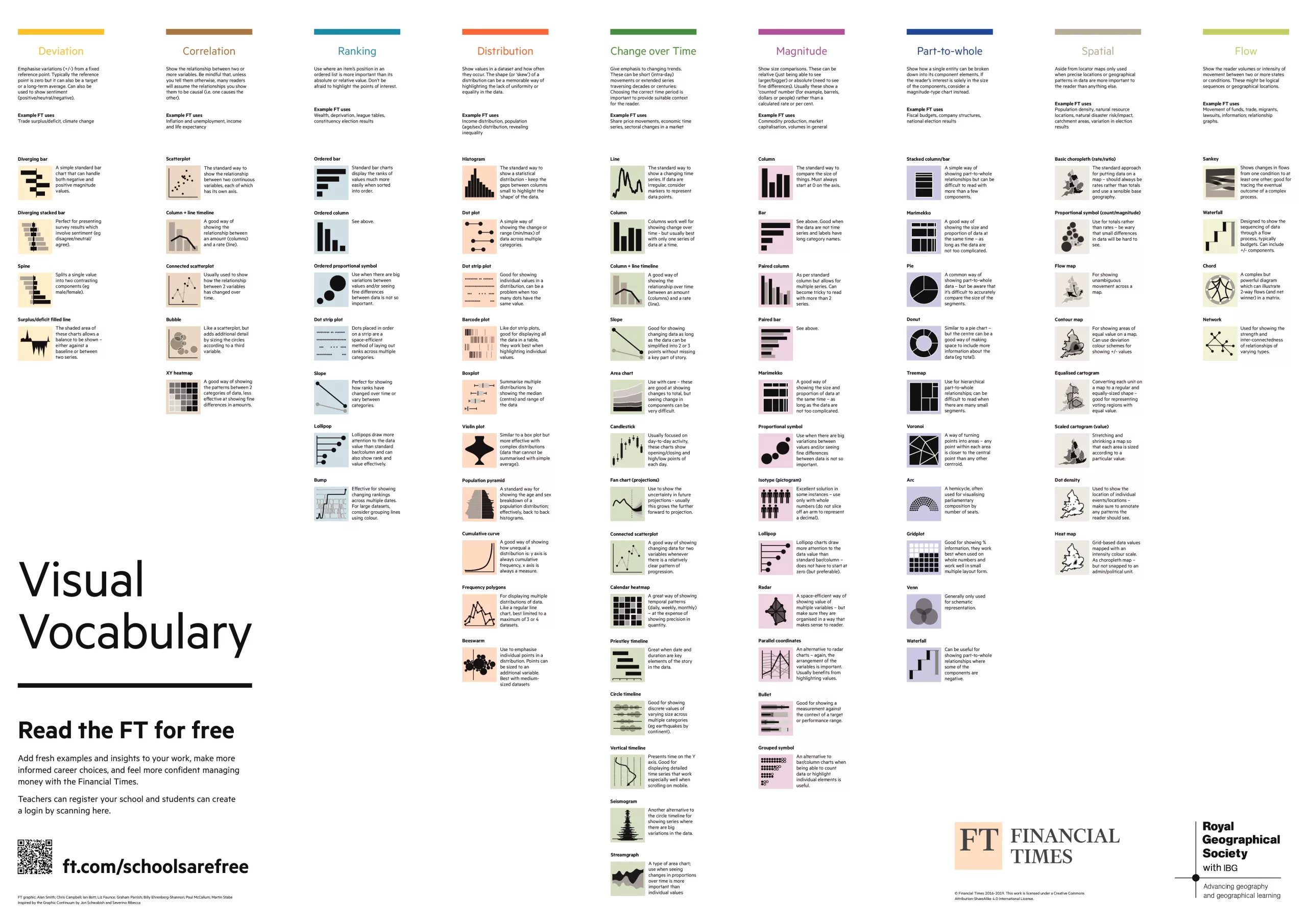
The people at the Financial Times teamed up with the Royal Geographical Society to make a poster that shows when to use what graph type, that’s simple enough to hold the attention of any teenage TikToker.

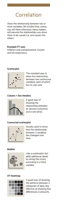
Under each category of data correlation, the typical applications are explained and then every suitable type of chart is described, along with tips on when is is and isn’t the best choice.
Download poster


